Princeton University Design System
Although Princeton Engineering already had a distinct branding from the overall university, it was lacking a design system for its digital platforms. I spearheaded the creation of their first design system, designing reusable UI components and building clear documentation on Figma to scale a cohesive digital experience across the entire school.
Company
Princeton University
Role
Individual Contributor
Deliverables
Design library, Component guideline, Design token
Timeline
2018 - 2019
Context
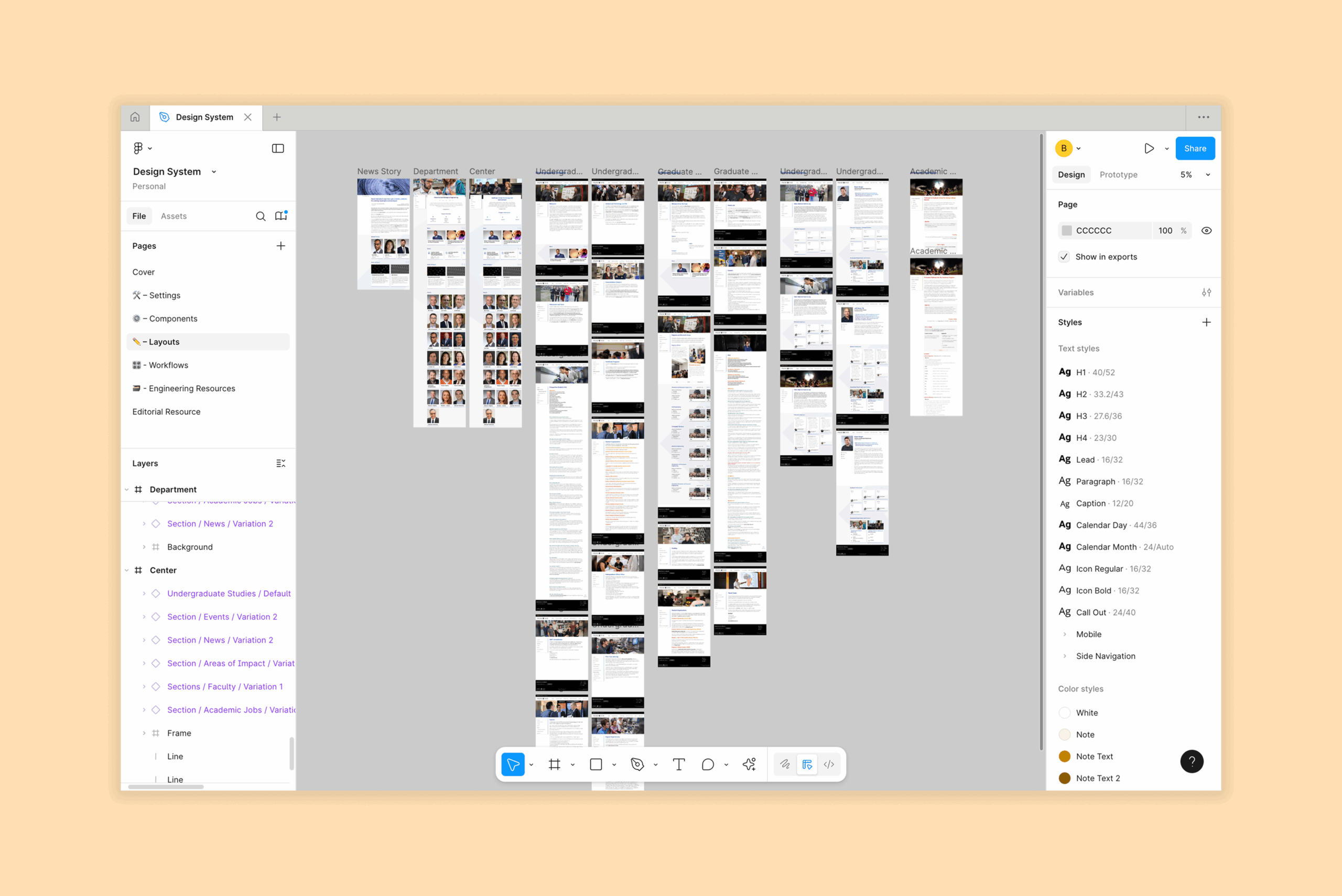
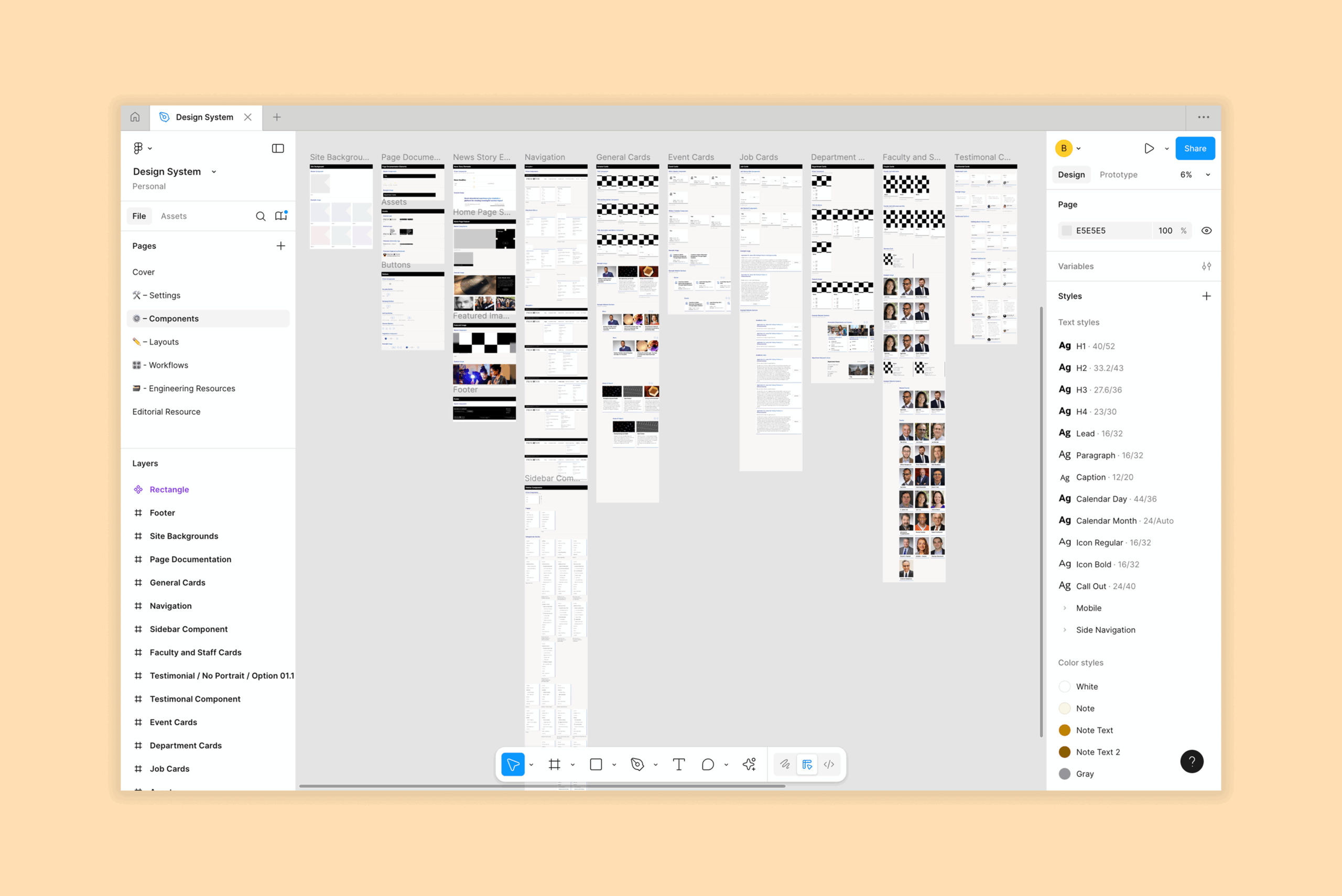
Princeton University's School of Engineering & Applied Sciences needed a stronger design foundation to keep up with rapid growth and rising interest from applicants. I led the effort to expand a simple Sketch library into a full design system that elevated the school’s brand and sped up prototyping. Transitioning to Figma made collaboration seamless, enabled real-time component building, and opened visibility to stakeholders without extra tools. The result was a faster, more polished design process that matched the school’s high standards.
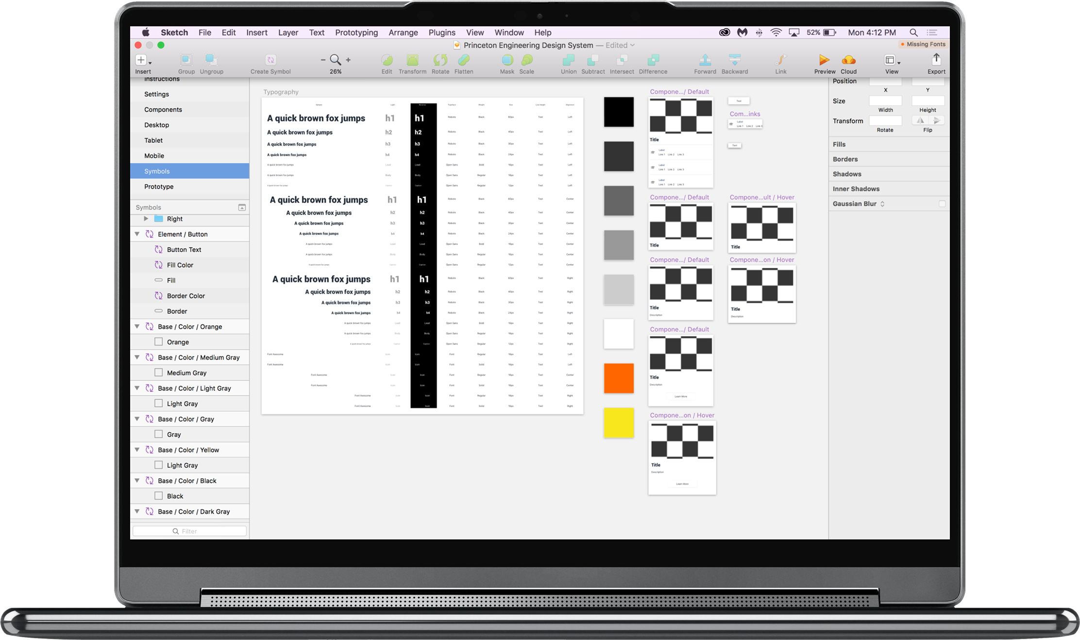
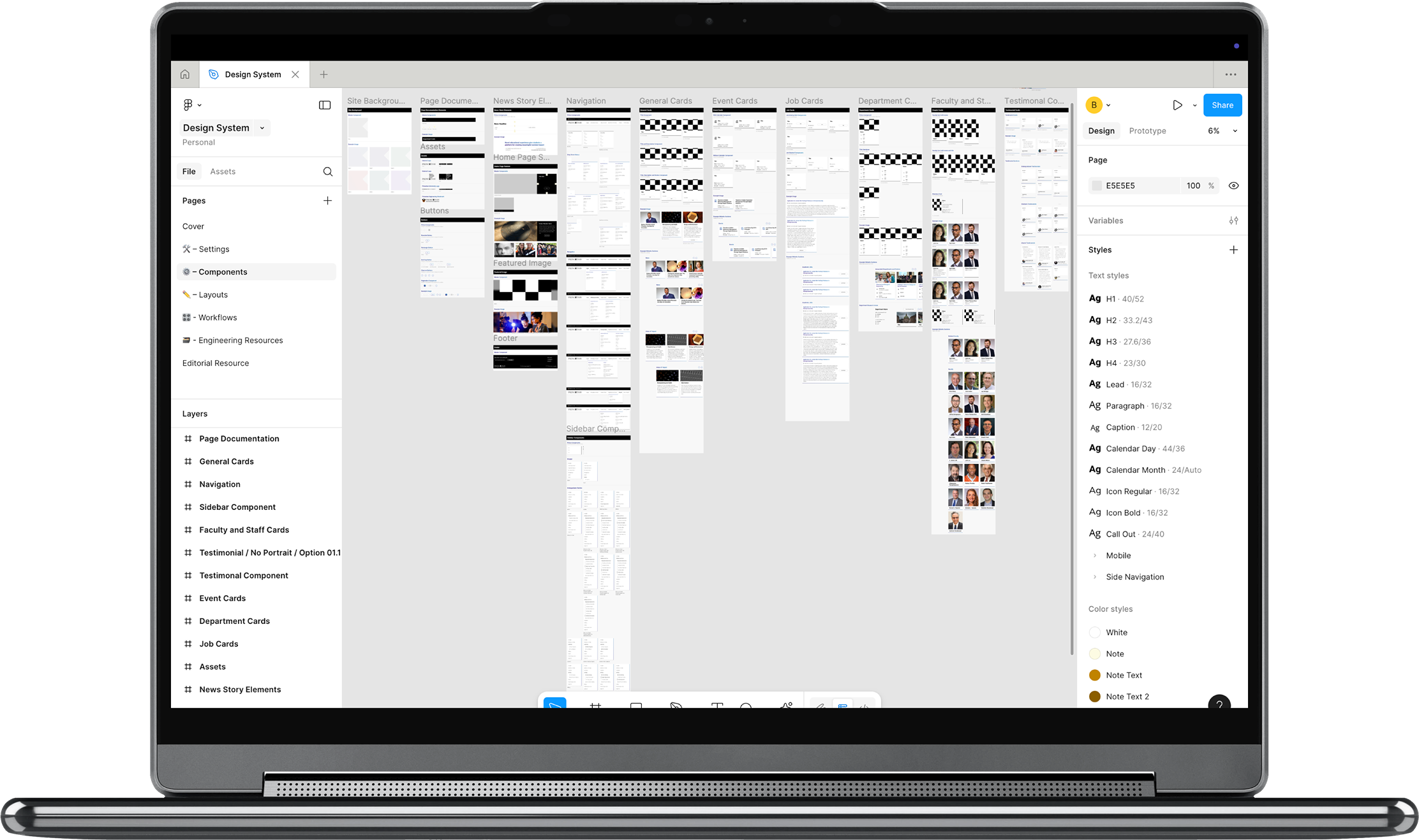
Before & After
Slide the cursor in the middle to compare the old Sketch-based design system with the new, fully built Figma system. Drag right to see the original, drag left to reveal the redesigned & extensive version.
The Challenge
One of the main challenges of this project was evolving Princeton Engineering’s design identity beyond the rigid university-wide guidelines while still staying true to Princeton’s brand. The school wanted to stand out from the main university with a visual language that felt modern, accessible, and scalable.
So instead of simply expanding the old Sketch library (which only had a few components in orange and black), we built a new structure in Figma driven by four key priorities:
Accessibility – proactively meeting WCAG 2.1 AA standards for typography and color.
Identity – introducing gradient colors to differentiate the engineering school while honoring Princeton’s heritage.
Consistency – creating components with precise spacing, margins, and documentation to remove guesswork.
Scalability – ensuring the system could grow with future prototypes, pages, and design needs.
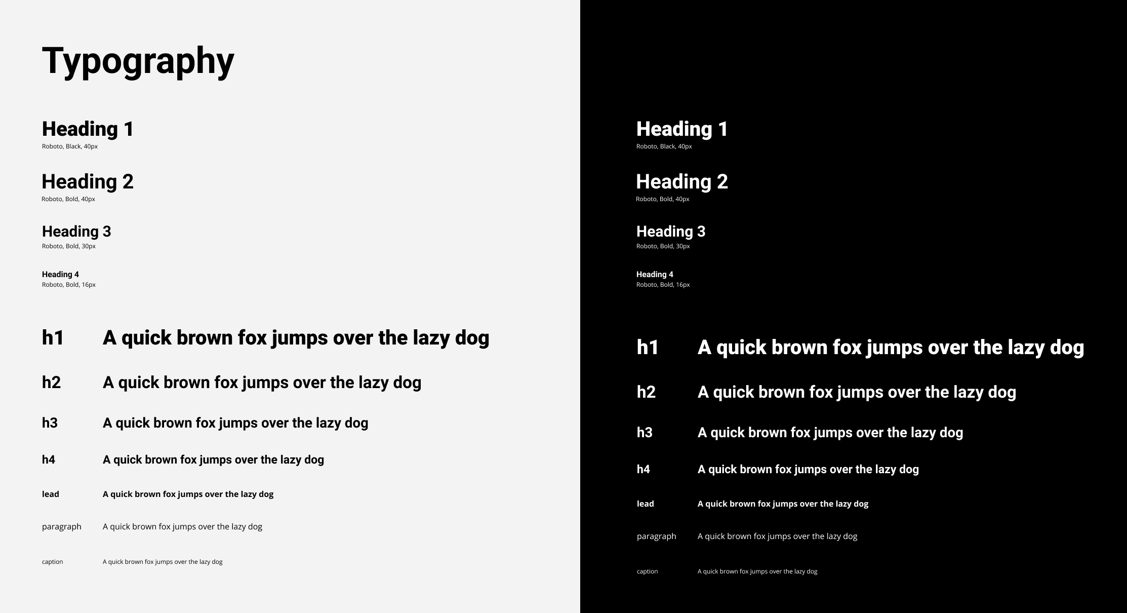
Typography
Balancing tradition with modern usability, the type system defines clear styles for headings, body, and captions. Accessible sizing and spacing ensure readability while reinforcing Princeton Engineering’s professional yet innovative identity.
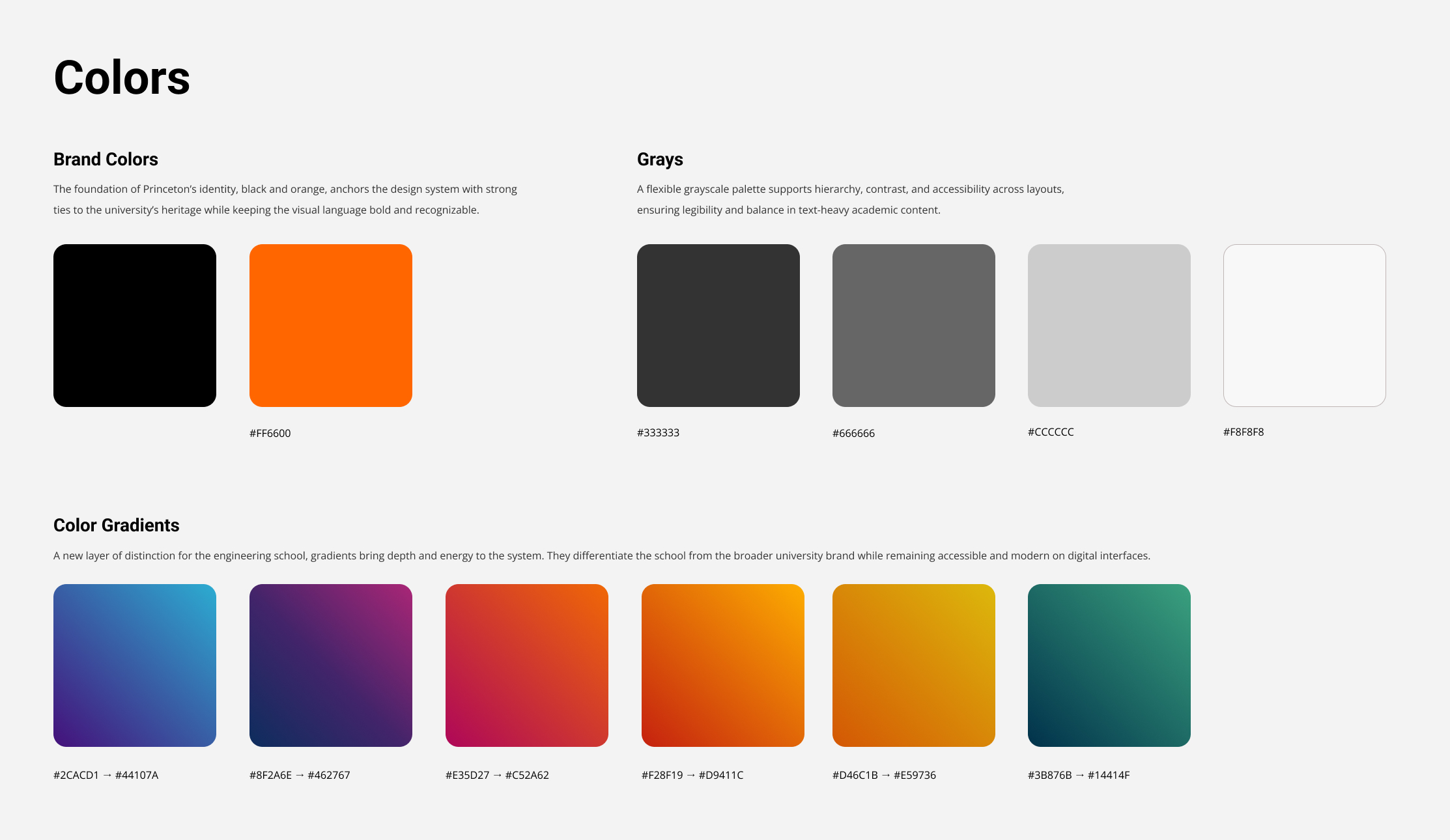
Brand Colors
The foundation of Princeton’s identity, black and orange, anchors the design system with strong ties to the university’s heritage while keeping the visual language bold and recognizable.
Grays
A flexible grayscale palette supports hierarchy, contrast, and accessibility across layouts, ensuring legibility and balance in text-heavy academic content.
Color Gradients
A new layer of distinction for the engineering school, gradients bring depth and energy to the system. They differentiate the school from the broader university brand while remaining accessible and modern on digital interfaces.
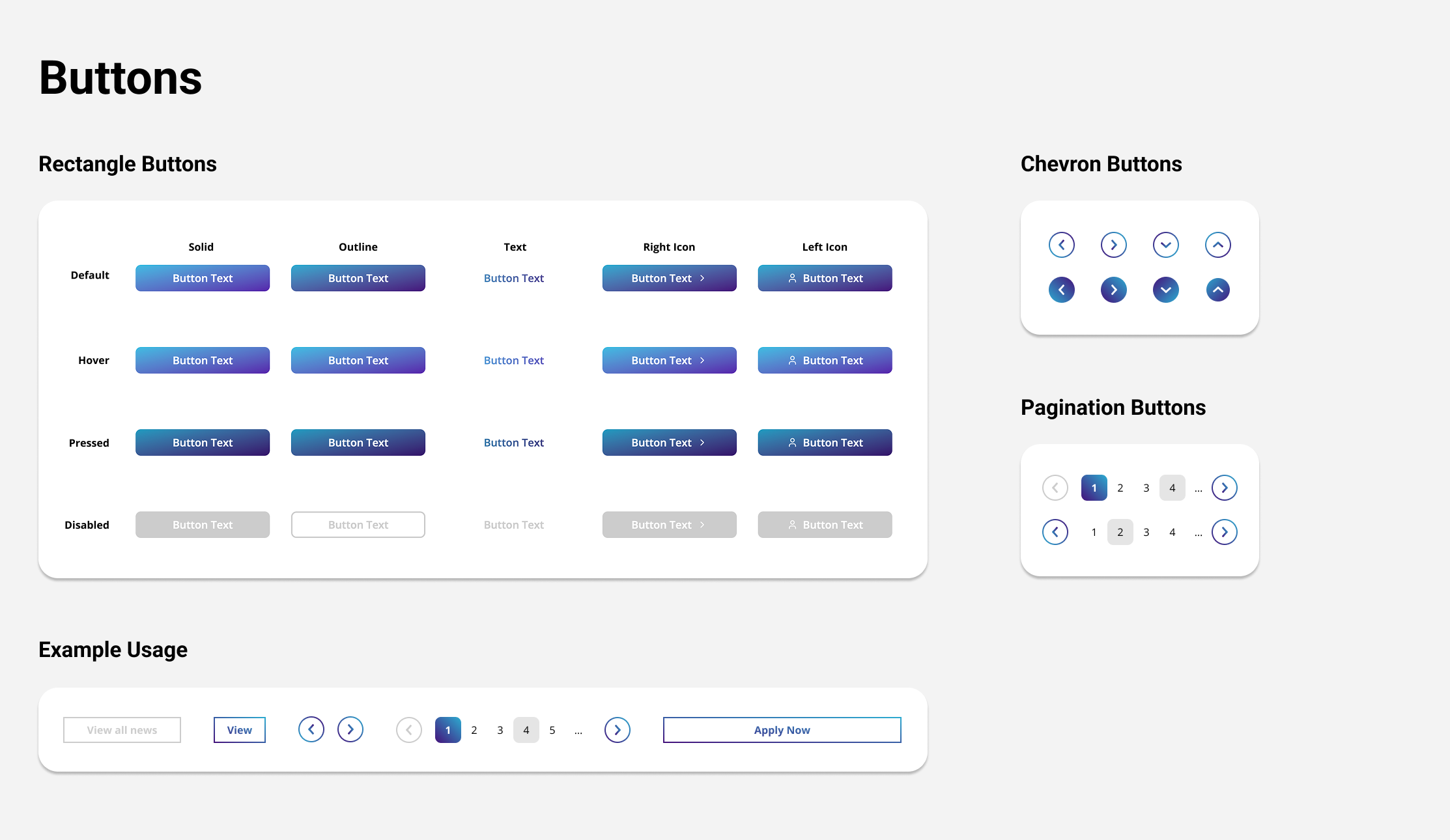
Buttons
Comprehensive button styles with states and variations (solid, outline, text, icons) for a consistent, accessible system.
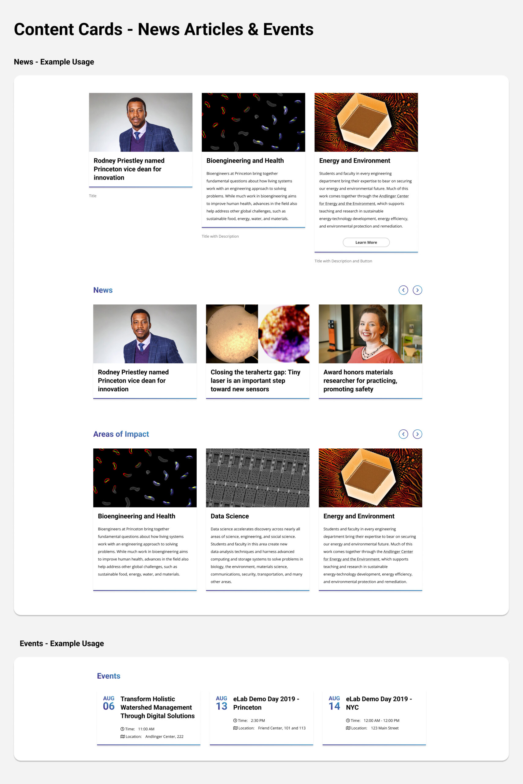
Content Cards
Content cards were designed as a flexible pattern for news, events, and research highlights on Princeton Engineering’s website. Each card balanced imagery, headlines, and supporting text to make dense academic content more approachable and scannable.
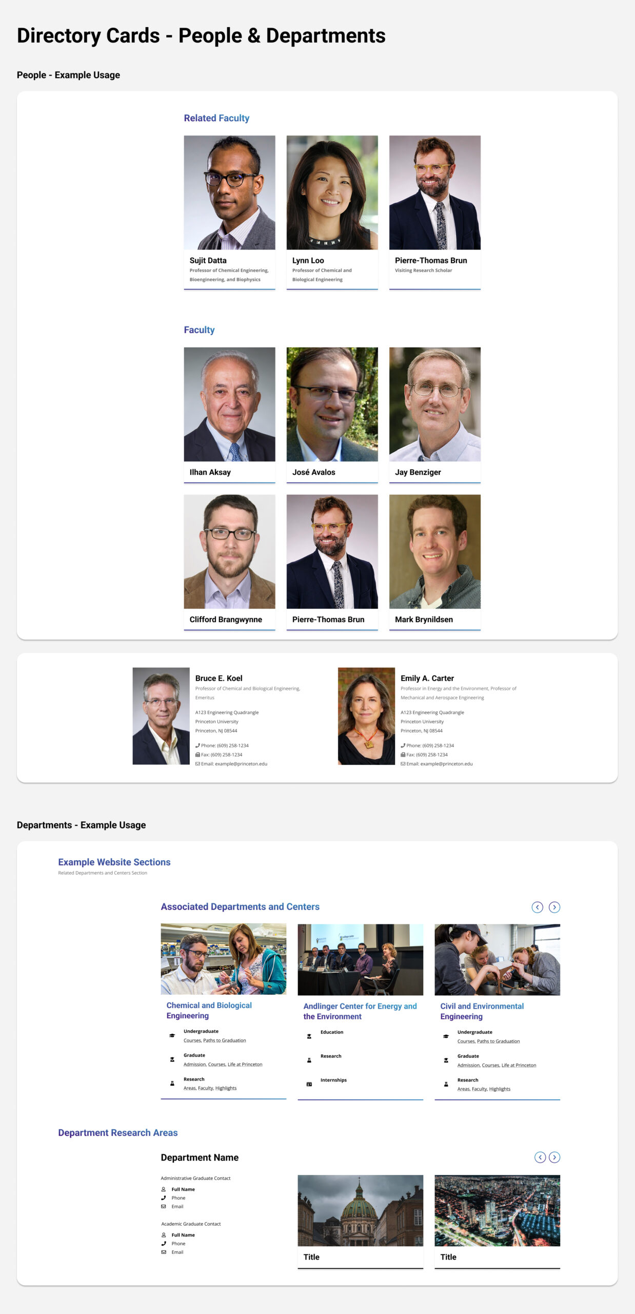
Directory Cards
Directory cards were for organizing structured information at scale. They emphasized clarity and repeatability, with defined grids and typographic hierarchy for names, roles, and metadata like contact info or research areas. Unlike content cards, directory cards helped users navigate large sets of information quickly — such as faculty directories or academic departments — without losing consistency or accessibility.
Outcome
As beautiful and frustating as it is, creating an active design system takes a lot of work because it is never really complete. After all, components were - and still are - being redesigned and modified. It was truly an iterative and challenging process, but knowing that I was part of creating a great resource for future work made it all worth it as the system continues to grow.
If you are interested in reading about user research that went into this design system, you can read Josh Cartagena's insights about Designing Findability Grounded in User Research or Building Better Search Experiences.