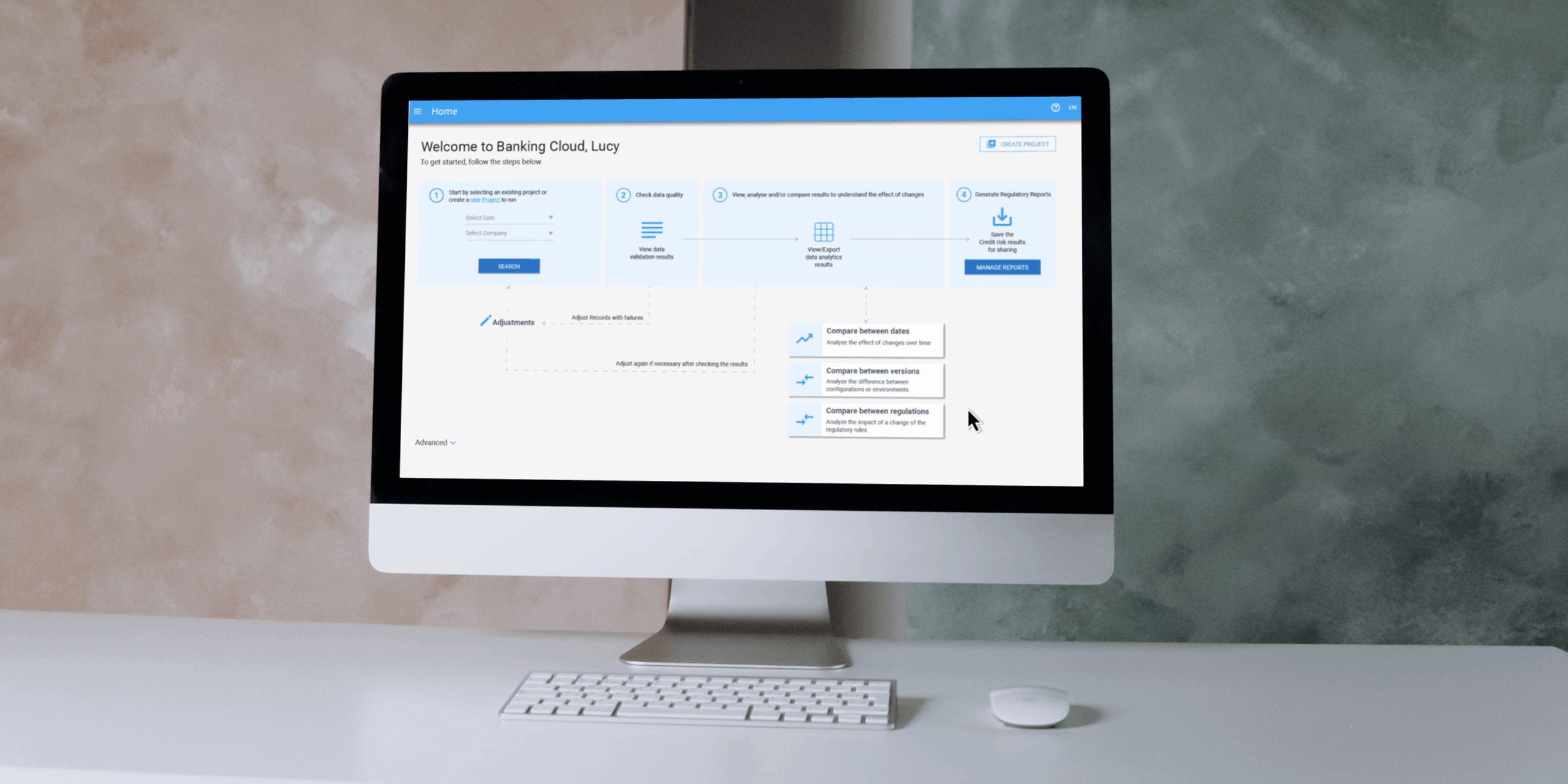
Moody's Banking Cloud Credit Risk
For my end-of-studies internship and master’s thesis, I joined Moody’s Analytics as a UX Design Intern on the Banking Technology team. My mission was to improve the user experience of the Banking Cloud platform, specifically within its Credit Risk solution. The platform helps financial institutions calculate regulatory capital requirements and assess portfolio-level risk in alignment with frameworks like Basel III and EBA CRR.
To honor my NDA, I’ve kept this case study free of confidential info. Designs are my own recreations using public design systems, and don’t reflect the views of Moody's.
Role
UX Design Intern
Team
Moody's, Banking Technology (Previously Moody's Analytics at the time)
Timeline
April 2021 - August 2021
Disciplines
UX/UI Design, Product Design, UX Research
Background
Banking Cloud is a cloud-native platform used by banks to generate regulatory calculations and reports. While technically powerful, the Credit Risk module had grown dense and difficult to navigate. My focus was to uncover usability challenges and propose design solutions that would make the experience more intuitive without sacrificing the system’s depth or flexibility.
The Challenge
Financial risk software is inherently complex, but complexity doesn’t have to mean confusion. Users needed to compare large volumes of regulatory data across projects, understand how results were calculated, and navigate a dense UI with little contextual guidance.
Internally, product and engineering teams often prioritized delivery speed and functionality over UX polish. Stakeholders noted that features were frequently shipped with minimal attention to usability or error recovery.
My Role
As a UX Design Intern on the Banking Cloud UX team, I was responsible for leading research and early-stage design strategy for the Credit Risk platform’s comparison tools feature. I was embedded in a global cross-functional team of about 50 people, collaborating with stakeholders from product management, QA, engineering, and UX, and worked closely with senior UX designers across offices in France and the UK.
Over the course of the project, I:
- Conducted stakeholder interviews with 5 internal experts across Product, QA, and Engineering
- Led thematic synthesis through affinity mapping
- Facilitated a design workshop with senior designers to co-define UX priorities
- Participated in a heuristic evaluation with 2 team members
- Delivered annotated design proposals and UX recommendations aligned with platform constraints and user needs
- Performing a WCAG Level A accessibility audit to evaluate compliance with global accessibility standards
- Delivering annotated wireframes and recommendations based on findings for roadmap consideration
I was part of a broader product team of ~50 people, but operated semi-independently within the UX function. I took initiative to identify pain points, structure insights, and advocate for user-centered improvements in a complex, highly regulated environment.
Our Design Goals
As a design team, we set the following objectives for this project:
- Map how internal teams interact with Credit Risk and where gaps appear
- Assess usability and accessibility of the comparison tools feature
- Pinpoint friction caused by time pressure, technical debt, or unclear UI
- Propose user-centered improvements that could scale across future releases
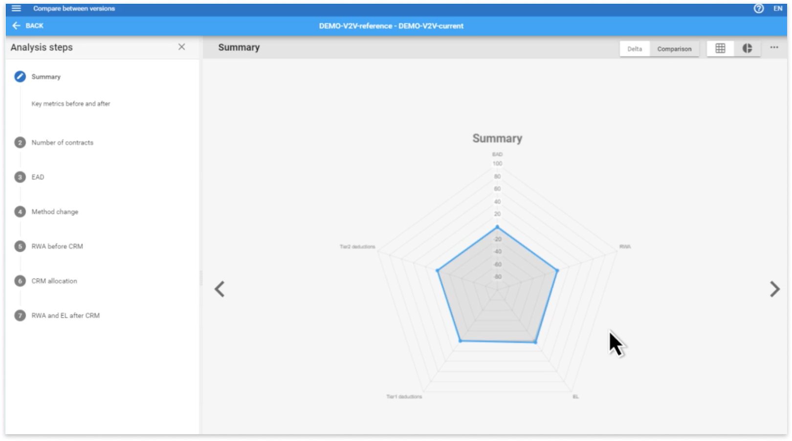
This screen is part of a Banking Cloud Credit Risk's multi-step comparison tool that helps analysts review how a financial scenario has changed over time, essentially comparing “before” and “after” versions of a project. The radar chart in the center visualizes key regulatory metrics, including Exposure at Default (EAD), which reflects potential losses if someone defaults; Risk-Weighted Assets (RWA), which indicate how risky the bank’s assets are; Tier 1 and Tier 2 deductions, which adjust capital based on the quality of financial instruments; and Expected Loss (EL), which represents model-predicted financial losses.
While the chart offered a comprehensive overview, users often struggled to interpret the data due to its visual density and lack of contextual guidance. This insight directly informed my design recommendations around progressive disclosure and more modular, focused layouts.
Research and Discovery
Before joining Moody’s Analytics, I had virtually no background in finance. Because of that, I knew I had to ramp up quickly—not just to understand the product, but to understand the people behind it. I treated this learning curve as a strength: it allowed me to approach the product with fresh eyes and question assumptions others may have grown used to.
I began my research by conducting semi-structured interviews with five internal stakeholders across product management, engineering, QA, and consulting. My goal was to understand:
- Their roles and responsibilities at Moody’s Analytics
- How they and their clients interact with the Credit Risk platform
- Pain points and feedback around the comparison tools feature
These interviews revealed both firsthand frustrations and secondhand client insights—particularly around usability trade-offs and product complexity.
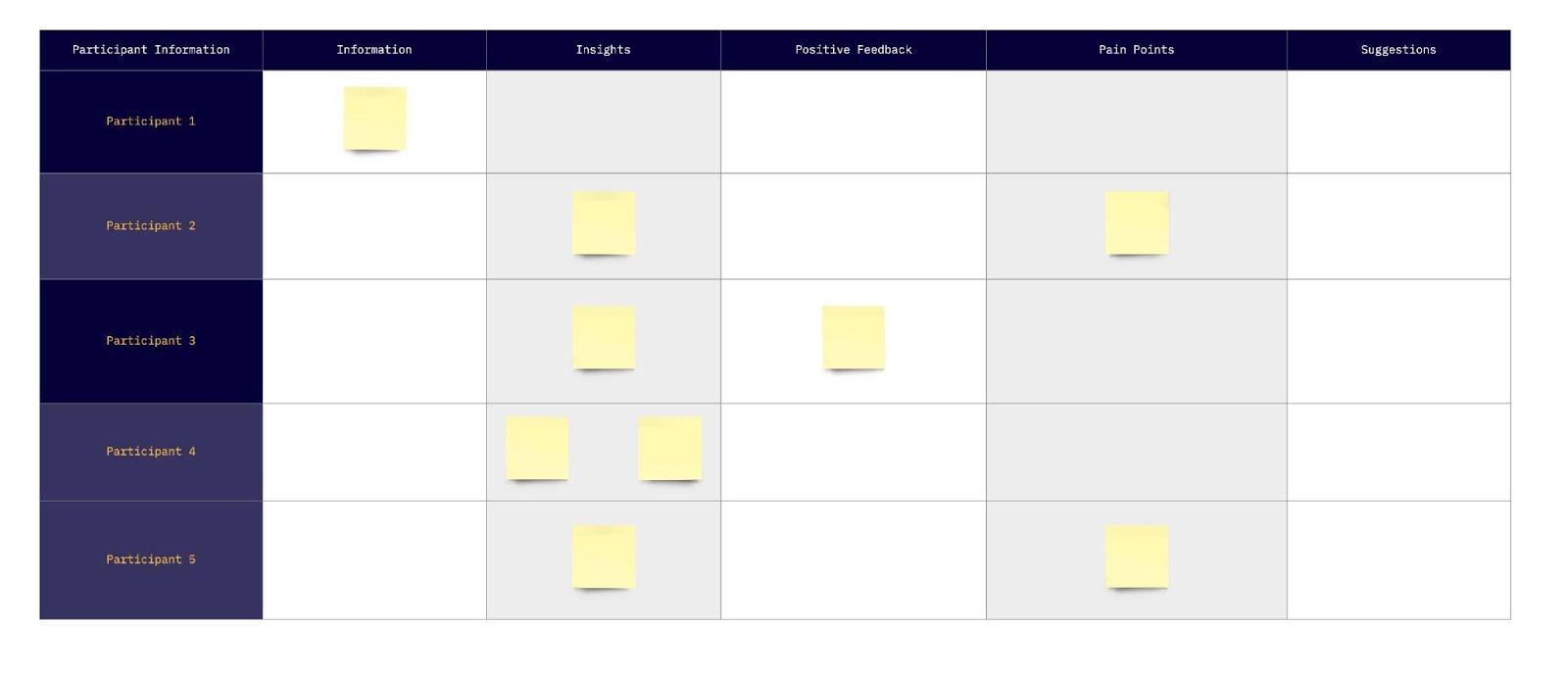
Organization of interview notes (Results omitted)
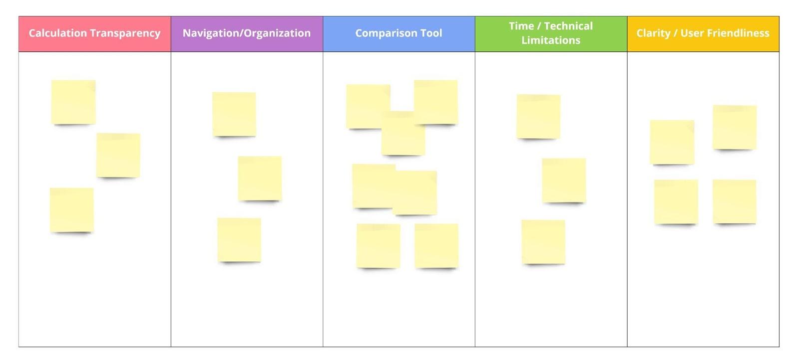
To synthesize what I heard, I organized the notes into five categories: information, insights, positive feedback, pain points, and suggestions. This helped me visually scan for patterns and quickly identify which comments could inform design decisions.
From there, I used affinity mapping to group related observations into thematic clusters. The key themes that emerged included:
- Calculation transparency
- Navigation and screen organization
- Time and technical constraints
- Clarity and cognitive load
- Usability of comparison tools
These themes became the foundation for a design workshop I later facilitated with senior designers, and ultimately shaped the problem framing and design direction of the project.
Affinity mapping of interview (Results omitted)
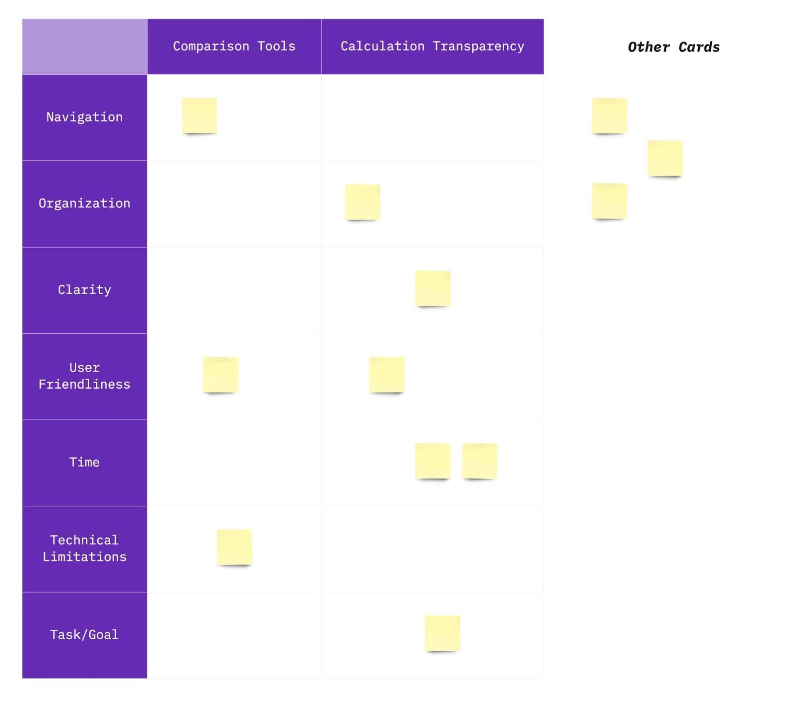
To validate and expand upon the themes from my affinity mapping, I organized a design workshop with senior UX designers on the Banking Cloud team. The goal was to revisit the findings from a broader, more experienced lens and reframe the insights in a way that could guide strategic design decisions across the Credit Risk platform and not just within the comparison tools feature.
The workshop used a custom-built matrix format. On the x-axis, we listed core features such as comparison tools and calculation transparency. On the y-axis, we included key influencing qualities like time constraints, technical limitations, navigation, organization, clarity, user friendliness, and task alignment. Participants were asked to sort post-it notes, that were originally derived from interview quotes and research, into this matrix based on where they felt each insight belonged.
Notes that didn’t clearly align with either axis were set aside into a separate “Other” category, which helped surface additional outliers and edge cases. This workshop not only deepened our understanding of the friction points across the platform, but also helped distinguish between product features and the experience qualities that shape how those features are used.
Design Workshop (Results omitted)
Key Insights
Although my original task was to improve the comparison tools feature, the research revealed broader usability challenges across the Banking Cloud Credit Risk platform. The tool is inherently complex, and designed to meet strict regulatory frameworks and serve analysts with deep domain knowledge. However, the interface needed to support a wider range of users, including those less familiar with the system.
One major insight stood out: many internal users were power users - but clients weren’t. Due to high turnover at client organizations, support teams had to retrain users frequently, and the platform often felt overwhelming for first-time users. These insights reflected deep tension between the product’s analytical power and its usability for real-world teams, especially newer users with little time for onboarding. In other words, how do we support expert analysts and first-time users within the same system?
Through stakeholder interviews and analysis, I identified three recurring themes:
1. Too Much, Too Soon
The platform displayed large volumes of data, visualizations, and project comparisons all at once without helping users prioritize what to look at first. While technically accurate, the experience was cognitively overwhelming.
"The graph is technically correct—but we’re asking users to decode it all at once."
— Senior Software Engineer
This was a recurring theme across interviews: the interface was functional but demanded a lot of interpretation. Users needed clearer guidance and a more structured path through the data, especially when exploring complex financial changes over time.
2. Transparency ≠ Usability
The calculation transparency feature was designed to show every logic step behind risk results. But in trying to be transparent, it overwhelmed users with raw data and exposed logic that wasn’t always meaningful at a glance.
"Clients say this lacks transparency compared to RiskAuthority… but RiskAuthority just hides all the steps. This actually shows them.”
— Product Manager
This revealed a disconnect between technical transparency and perceived clarity. Full exposure of logic wasn’t helpful without context or scaffolding. Users needed simplified explanations first, with deeper layers available on demand.
3. Time & Tech Constraints Shape UX
Because many clients faced strict go-live deadlines, the team often prioritized functionality and bug fixes over refining the user experience. Several team members explained how these constraints limited their ability to make UX improvements within release cycles.
“Sometimes things are not good with the user interface, but we must release new features… Functionality is a priority rather than delivering with a lot of bugs.”
— Software Engineer
“Because of time sensitivity for clients going live with the product, the priority is to fix bugs before clients go live... After bug fixes, it creates more comfort and time to work on new enhancements.”
— Product Analyst
“We had suggestions to beautify a graph in the software, but we found that we were limited by technology to do so.”
— Senior Product Consultant
These reflections framed the very real technical and business pressures shaping the product and helped me focus my design recommendations on low-lift, high-impact opportunities.
4. Supporting Both Beginners and Experts
Unlike internal teams at Moody’s who were fluent with the product, many client teams faced high turnover and limited onboarding resources. As a result, product and support teams spent significant time re-training users on how to use the platform.
“There must be a balance between experienced users and those using the page for the first time… We assist one of our clients a lot for learning the software. After all, this client has a big turnover problem, so we have training with them over and over again.”
— Senior Product Consultant
This quote crystallized the importance of designing for progressive learning, giving beginner users a manageable entry point while ensuring advanced users could still work efficiently.
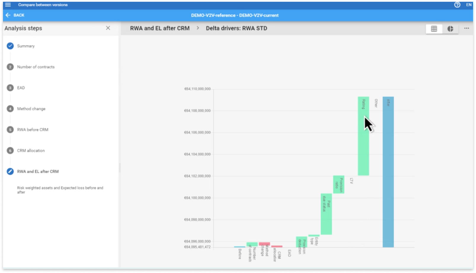
A detailed step within the comparison Ffeatures workflow showing changes in risk-weighted assets and expected loss after credit risk mitigation. While the visualization is data-rich, users had to interpret complex deltas with little interaction support or contextual explanation. This lead to confusion, especially when switching between steps in the left-hand flow.
Design Principles I Proposed
To address the challenges uncovered in research - particularly around cognitive overload, inconsistent clarity, and the needs of both novice and expert users - I proposed a set of design principles focused on creating a more structured, approachable, and scalable experience within the comparison tools feature.
 Progressive Disclosure
Reveal information gradually, prioritizing what users need to see first.
Instead of overwhelming users with every detail at once (e.g., full calculation logic or comparison breakdowns), key insights and summaries should be shown upfront—with expandable sections, tooltips, or modals offering deeper layers of information for those who need them. This approach reduces visual noise and supports both exploration and learnability.
Modular Layout Design
Break down dense content into clearly defined sections.
Organizing information into logical, collapsible modules allows users to scan the interface more efficiently and stay oriented as they move between datasets or calculation views. This also improves the system’s ability to scale as new functionality is added—without adding visual clutter.
Contextual Tooltips and Inline Explanations
Support user understanding without forcing them to leave the screen.
I recommended adding in-place help (e.g., hover-triggered tooltips, info icons, or field-level pop-ups) to explain key terminology and logic patterns—especially in areas involving risk weight changes, project comparisons, and scenario assumptions. This reduces reliance on documentation and lowers the learning curve for newer users.
Visual Feedback and System Status Cues
Make system behavior visible and reassuring.
During testing and heuristic evaluation, it became clear that users lacked feedback when triggering actions (like loading comparison projects or generating reports). I proposed integrating loading indicators, success confirmations, and subtle error prevention cues to help users stay informed and in control throughout their workflow.
Flexible Defaults for Varying User Types
Cater to both beginners and experienced users with adjustable UI behavior.
Given that some clients were brand new to the system and others deeply embedded in it, I suggested default views that could be configured by user role or saved preferences. This might include a simplified view mode for new users and an advanced view with power filters or raw calculation logic for seasoned analysts.
Together, these principles supported a more scalable and adaptive experience, making it easier for users to focus on what matters, without sacrificing the depth and rigor required in financial risk reporting.
Due to confidentiality agreements, I’m unable to share final design files or prototypes. However, the following table outlines a few key improvements I proposed to address usability and accessibility challenges uncovered during research and evaluation:
Before & After (Conceptual)
Before
Static, dense chart of comparison data
No feedback during workflows
"Transparent" logic shown as raw calculations
After
Expandable modules with clearer visual hierarchy and progressive detail
Inline status updates, loading indicators, and confirmation cues
Contextual tooltips and layered explanations to support understanding
These conceptual changes were designed to reduce cognitive overload, improve task flow, and support a wider range of users - from seasoned analysts to first-time users working under regulatory pressure.
Evaluation & Accessibility
I partnered with two senior designers to conduct a heuristic evaluation of the comparison tools feature using Nielsen’s 10 Usability Heuristics. We evaluated over 250 individual criteria and identified several recurring issues, particularly in:
- Visibility of system status: Lack of loading indicators or confirmation messages created uncertainty during long-running operations.
- Error prevention and recovery: Error messaging was inconsistent or absent, making it hard for users to recover from mistakes.
- Recognition vs. recall: Icons and chart elements lacked labels or explanations, requiring users to remember their meaning from training sessions or documentation.
To complement the usability audit, I also conducted an accessibility review using the W3C’s WCAG 2.1 Level A checklist. While the feature passed most criteria, I flagged a color contrast issue in critical graph elements that could reduce readability for users with low vision. This surfaced the need for better alignment with accessible design patterns, especially in internal enterprise tools.
Impact
Nased on the issues found in the previous steps, I proposed several solutions to improving Banking Cloud. Adhering to Moody's Analytics' style guide, I was responsible for creating clickable prototypes in Adobe XD. All of the design insights, solutions, and prototypes I have provided were communicated to various groups of stakeholders, and were considered for implementation onto the next software release.
Some examples of my impact included:
- Presenting key findings from research, heuristic evaluation, and accessibility audit to product leadership and senior UX stakeholders.
- Delivering annotated wireframes aligned with platform constraints, which influenced backlog prioritization for future sprints.
- Helping teams recognize the trade-offs between speed, functionality, and usability - especially in high-pressure delivery cycles.
- Advocating for layered onboarding and progressive disclosure as scalable strategies for supporting diverse user skill levels.
Reflections
This project challenged me to navigate complexity - both in terms of the product and the organizational environment. Entering with no finance background, I had to quickly build domain knowledge, interview cross-functional teams, and synthesize conflicting feedback into a clear design vision.
At first, I was eager but intimidated to work for such a large company and product. As a young designer, I had to keep reminding myself that UX design is a process, especially when dealing with such a complex software. Learning information as complex as this takes time. It’s fine to not know everything in the beginning. There’s a lot to learn, but understanding as much domain knowledge as I could was one of the goals I set for this internship. Overall, I can honestly say this goal was more than exceeded.
This project was probably one of the most challenging projects that I had ever faced, and I felt overwhelmed at times, when trying to piece together solutions for all the issues I found, due to the sheer volume and breadth of the system. However, these frustrations were all learning experiences for me, as I knew that resolving these issues would only help me get better at capturing the big picture experience.
Throughout the process, I learned how to:
- Lead UX research and synthesis in a fast-paced enterprise environment
- Translate ambiguous requirements into structured insights and actionable designs
- Advocate for accessibility and usability in contexts where they’re often overlooked
- Balance the needs of expert users and first-time users in a data-heavy, high-stakes system
Above all, this project taught me that good UX doesn’t mean hiding complexity - it means revealing it intentionally, so the right people can see the right information at the right time.
Despite some of these challenges, I would like to especially thank the rest of the Banking Cloud team and the recruiting team at Moody’s Analytics, who have welcomed me with kindness and made my onboarding process as seamless as possible even while I was working remotely due to the pandemic. Even more so, they introduced me to working in a truly international environment as I am not from Europe/UK. They have been wonderful people to work with because they have always been willing to take time to help me out with any problems I had with my own projects. Their support, kindness, and commitment to user experience made this project both challenging and deeply rewarding.